Stuck in a style rut? Always reaching for the same safe shades? Take a cue from the Princess of Wales. Her wardrobe proves that sometimes the best colour pairings aren’t the most obvious ones.
From rose and red to charcoal and chocolate, see what works on Kate, and learn how to incorporate these clever combinations into your own wardrobe.
Let’s start with these two hues we were told never to pair:
1. Red & Rose
Growing up, we were told never to wear red and pink together—the clash was considered a major fashion faux pas. But in 2019, Kate proved everyone wrong when she paired a rose-pink Stella McCartney dress with crimson accessories for Prince Archie’s christening.
That summer, a royal insider told People that Kate had been “experimenting to add a little edge” to her wardrobe after feeling stuck in a bit of a style rut. “She’s consciously worked on getting her look to be a bit younger and more modern, and it’s worked,” the source said.
The bold colour pairing did exactly that—it felt fresh, confident, and just a touch unexpected.
Why it works: The pairing is bold yet balanced—one deep shade, one soft. The red doesn’t overpower, and Kate kept the look refined by skipping busy prints and heavy statement jewellery.
Try it: Heading to a wedding? Wear a coat and dress in the same shade of pink, and pair with red accessories for an effortlessly elevated look. Finish with delicate pearl jewellery.
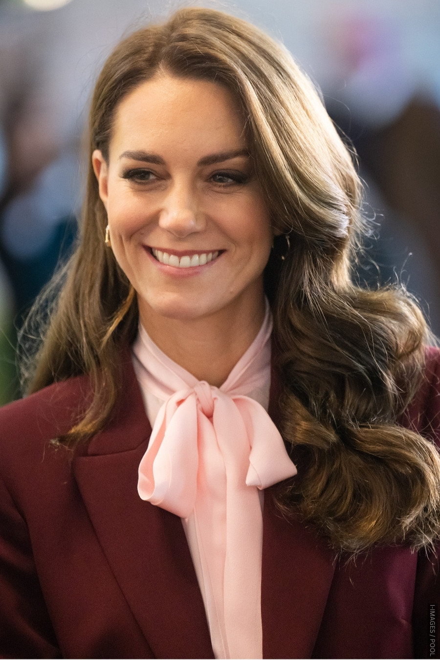
2. Burgundy & Blush
It’s often tricky to know what pairs well with burgundy, especially when it’s the dominant colour in your outfit. Kate solved the dilemma during the 2022 Earthshot trip to Boston, wearing a blush pussy-bow blouse beneath her burgundy Roland Mouret suit:
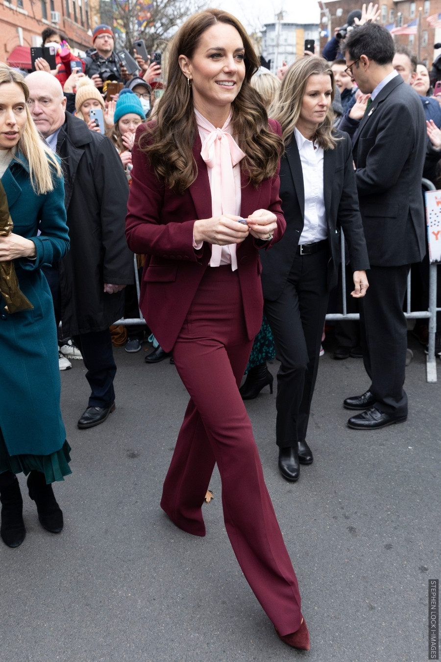
Harper’s Bazaar named this one of Kate’s best power suit looks to date, noting it was a favourite among royal watchers. Vogue called the look a “twist on a classic” that “looked prim and proper but leaned retro rather than modern”.
Why it works: The deep burgundy colour anchors the look; the blush pussybow shirt adds lightness and femininity.
Try it: This colour combination would work well in any setting but take a cue from Kate and wear it in the office—think burgundy tailoring paired with a blush blouse, or a blush dress worn with burgundy accessories.
3. Rose & Soft Grey
Kate rewore the rose-pink blouse recently; this time pairing it with grey trousers and a coat in the same shade.
Why it works: The delicate pink and soft grey feel crisp and contemporary together. The pink brings warmth; the grey keeps it grounded.
Try it: And easy-to-wear combination. Copy and Kate and wear a pink top under a grey suit or coat—or grey trousers with a blush knit.
4. Camel & Navy
We’re so used to Kate’s tone-on-tone layering that it felt like a refreshing change when she topped a navy ensemble with a camel coat during a 2023 visit to a nursing home.
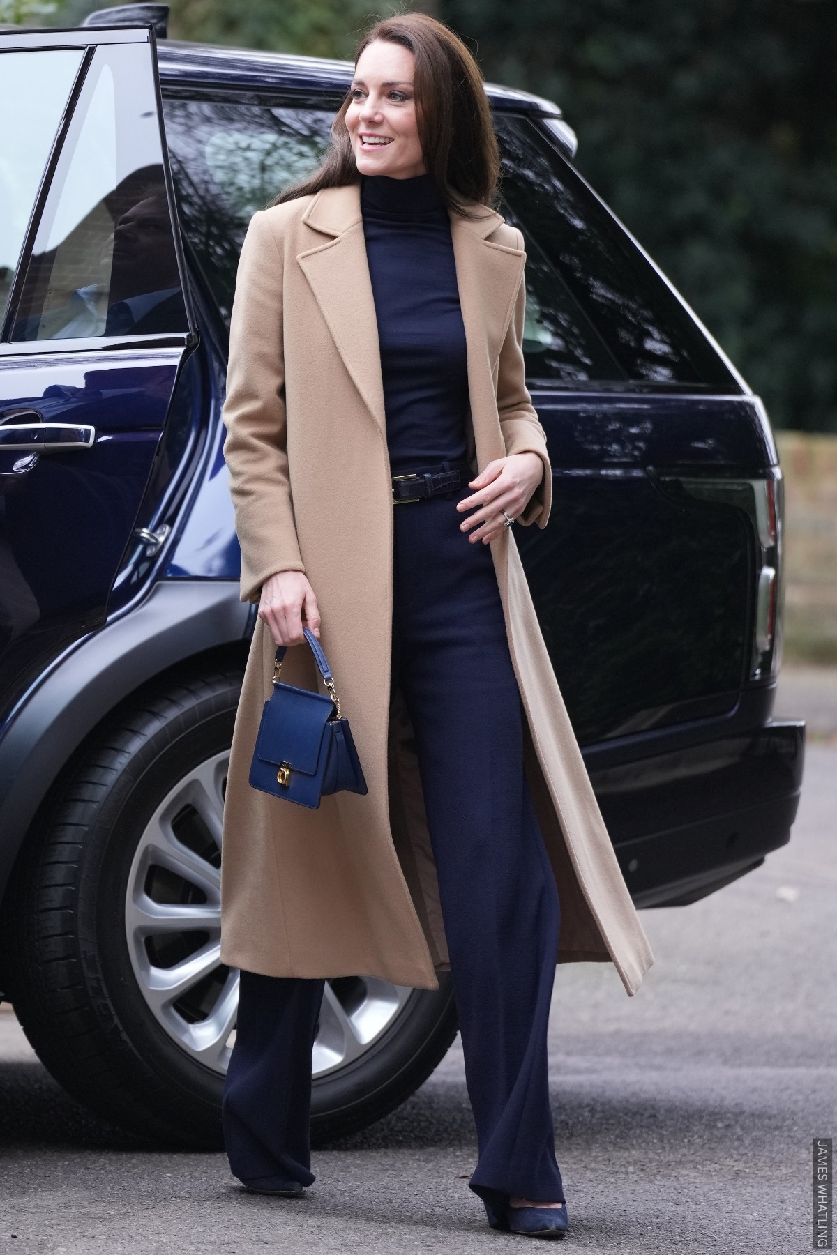
The result? An eye-catching, bold look that isn’t too ‘out there.’
Why it works: Warm camel softens the navy, creating a chic and approachable contrast. The long, open coat also breaks up the column of blue underneath, adding depth while keeping the look effortlessly polished.
Try it: This colour combo is effortless for work — pair navy trousers and a matching top with a camel coat, a timeless wardrobe staple. Instant smart-casual polish.
5. Emerald & Navy
Kate’s paired emerald green and navy blue together on several occasions, including during a visit to Merseyside in 2023 (below).
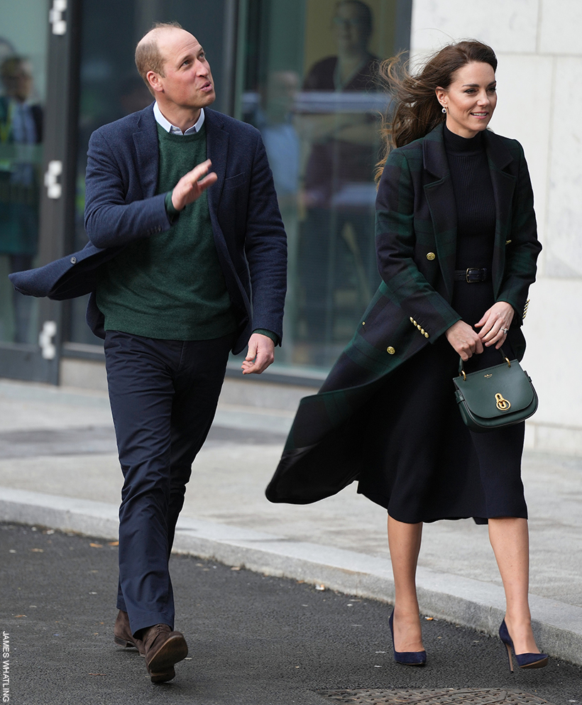
She paired the checked Holland Cooper coat with navy suede heels and a green Mulberry handbag. I love how the gold accents in the bag’s hardware echo the buttons on her coat—a small detail that ties the whole look together.

Why it works: Navy grounds the look, while green adds richness and depth. It feels polished, elegant.
Try it: A navy base (dress or trousers) with one green accent — such as a bag or coat—it keeps the combo bold yet wearable.
6. Lilac & Powder Blue
Kate paired lilac and powder blue for a springtime engagement in 2022, during a visit to Cambridgeshire with her husband William:
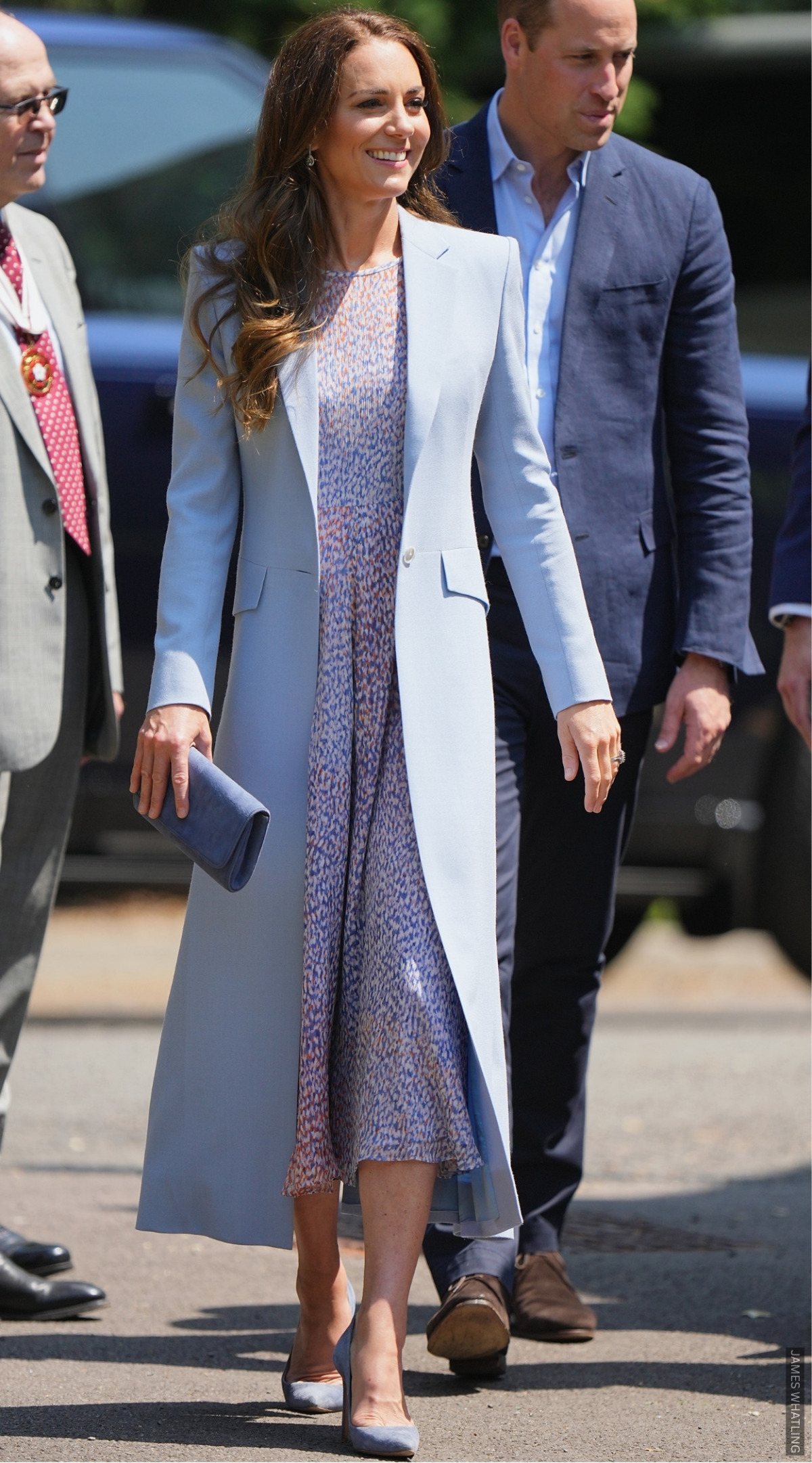
The duck-egg blue coat and lilac printed dress made the perfect spring combination, the two colours felt fresh and sophisticated paired together.
Why it works: Both shades are cool and soft; they’re not often worn together, but it works. It’s elegant.
Try it: Consider a blue dress with lilac accessories for spring events. For your workplace, try a lilac printed blouse under a powder-blue blazer.
7. Olive & Tan
Last month, Kate chose an olive-green suit for a visit to Home-Start Oxford. She finished the look with tan heels:
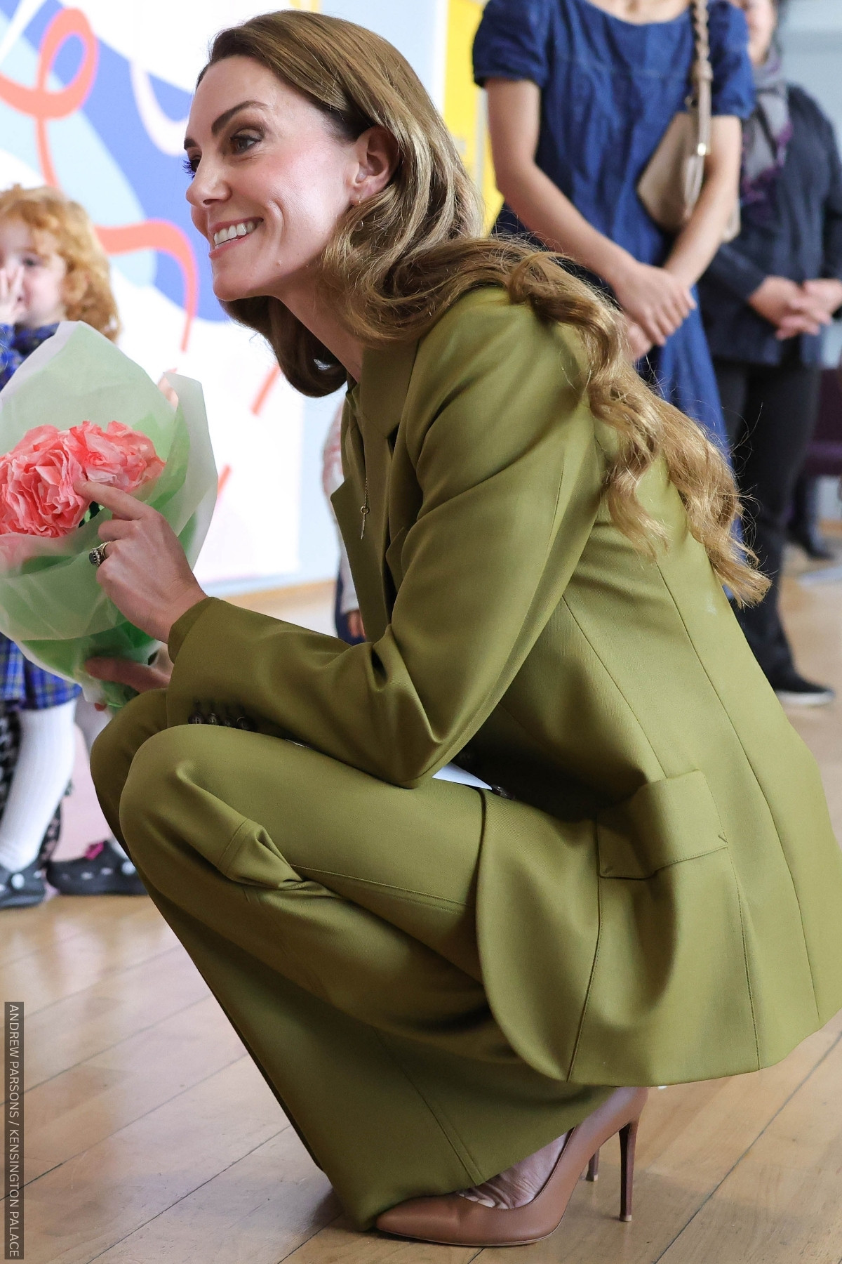
I had expected the Princess to wear tonal olive shoes with this suit—so the tan was a nice surprise.
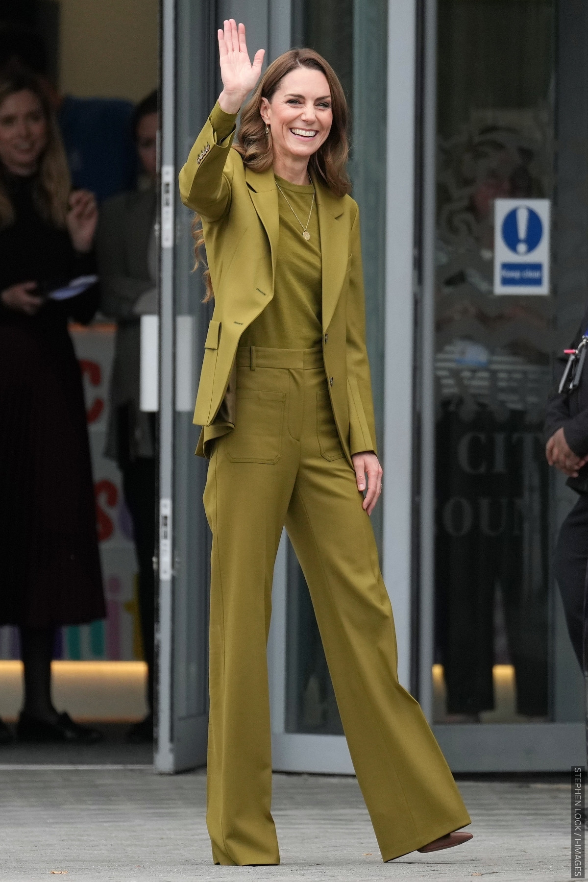
Why it works: Olive is a slightly offbeat colour, yet the tailoring is sleek and sophisticated. The tan shoe is a nice contrast, but keeps the look easy to wear.
Try it: Olive separates with tan shoes for the workplace. Feeling bold? Try an olive green dress under a tan trench coat, and finish with tan shoes.
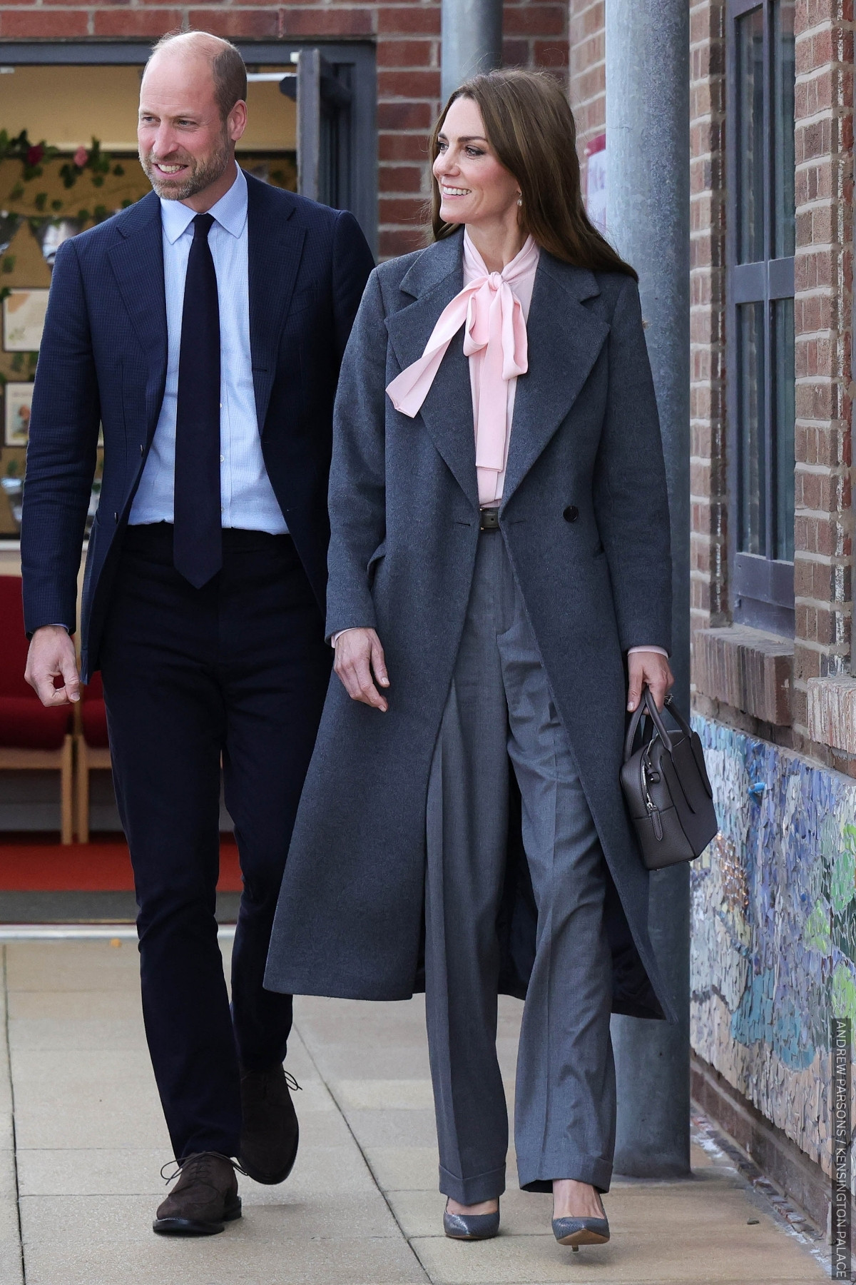
8. Charcoal & Chocolate
Chocolate brown tends to get paired with other shades from the same family—tan, camel, beige, and mocha. But Kate proves that it works with grey, too.
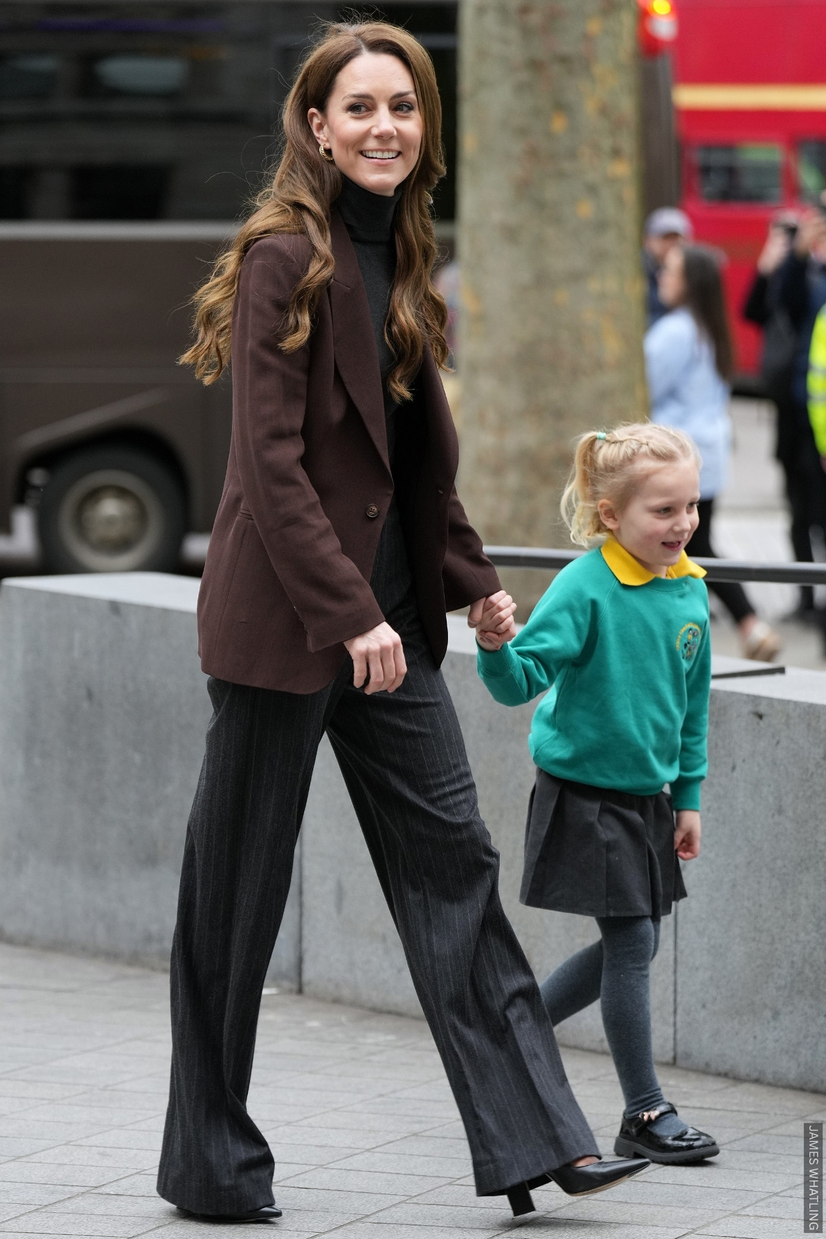
For an engagement at the National Portrait Gallery earlier this year, the Princess wore a brown blazer over a grey rollneck, finishing the look with pinstripe trousers and pointed black shoes.
Why it works: The dark grey brings structure; chocolate brown adds warmth. Together, they read “quiet luxury”.
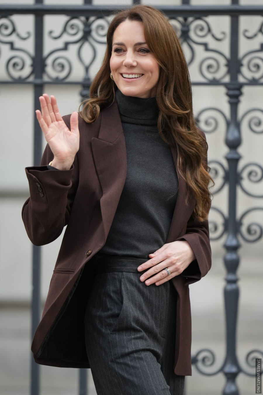
Try it: You could copy Kate directly and pair grey basics topped with a brown blazer or coat. A charcoal grey dress with a brown belt and black shoes would work too.
Ah, on to one of my favourite looks now.
9. Red & Tan
Red can be tricky to accessorise — brown often feels too heavy, while black risks veering into Mrs Claus territory. Kate showed us that tan is the perfect solution at an for The Forward Trust in 2021:
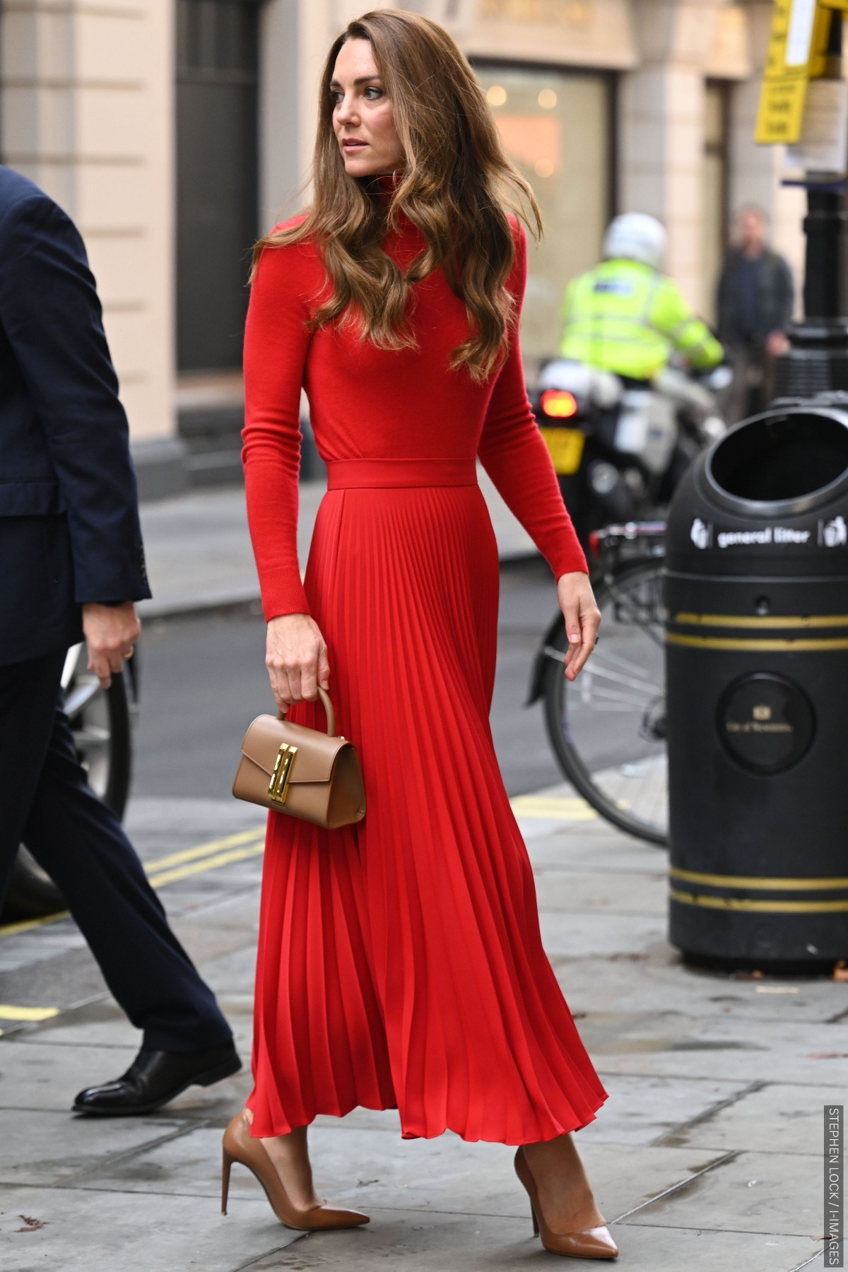
Why it works: Tan softens the impact of red while keeping it bold. Chocolate brown is too heavy, black feels too harsh; tan is a good autumn neutral and adds a touch of warmth.
Try it: Just straight up copy this look—pleated skirt, knit, accessories. It’s chic, it’s wearable (and it’s one of my favourites).
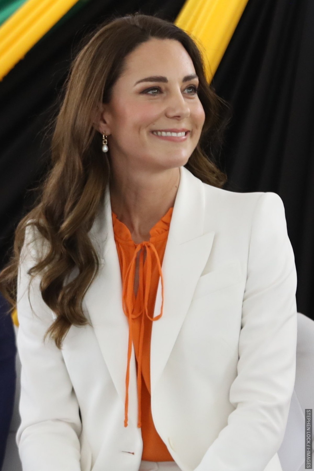
10. Orange & White
Kate brought a burst of sunshine to Jamaica in 2022 with this eye-catching orange Ridley London blouse. She paired it with a crisp white Alexander McQueen suit and a matching orange vintage bag.
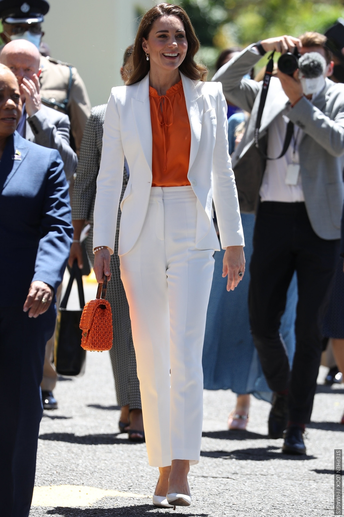
Why it works: Orange can be overpowering, but pairing it with pure white keeps it bright, modern, and effortless. The contrast feels fresh and summery rather than loud.
Try it: Pair a bold orange blouse or top with tailored white trousers, or echo Kate’s look with an orange dress and white accessories for an instant warm-weather lift.
11. Purple & Navy
Kate turned heads in a vibrant purple Emilia Wickstead suit in Northern Ireland in 2021. She layered the blazer over a navy turtleneck and completed the look with navy pumps—a daring yet refined colour clash that felt both regal and modern.
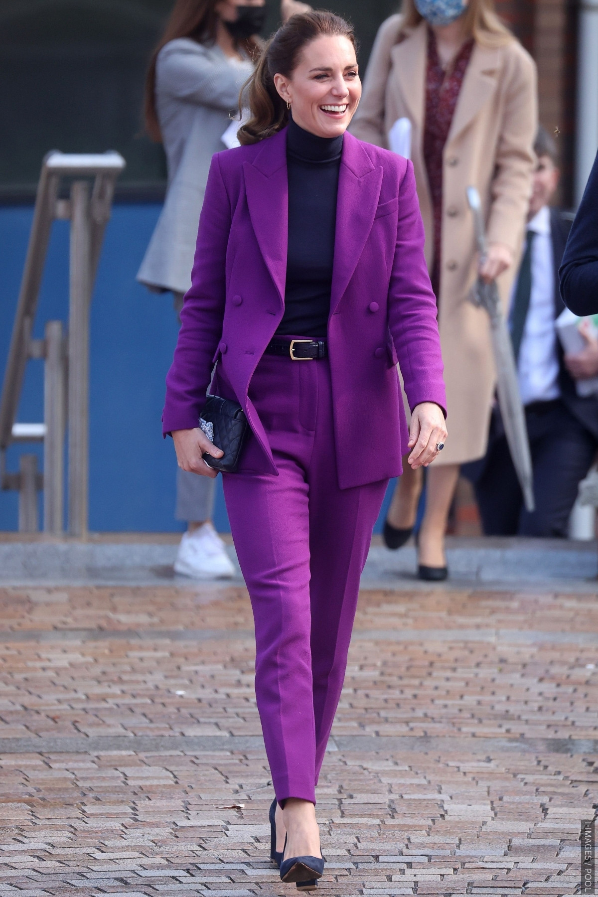
Why it works: Purple brings energy and confidence, while navy grounds the hue, preventing the look from feeling too loud. The result is striking but completely wearable.
Try it: Pair a purple blazer or trousers with a navy knit, or wear a deep navy dress with purple accessories for a subtle nod to this royal-approved combo.
12. Grey & Forest Green
For Christmas Day service at Sandringham in 2019, Kate wore a grey Catherine Walker coat trimmed with faux fur, paired with forest-green accessories—a matching hat, clutch and heels.
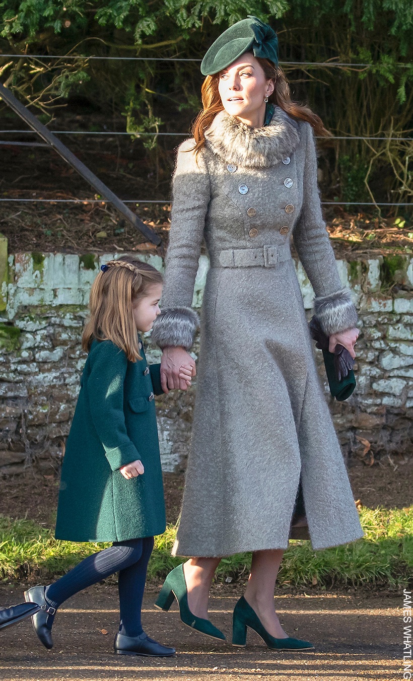
Why it works: The cool, textured grey creates the perfect backdrop for rich green accessories, proving neutral shades don’t have to be dull. The result is luxurious, wintery, and deeply elegant.
Try it: Swap black for deep green next time you wear grey. A grey coat with a green bag or shoes instantly feels softer — and far more regal. Try this at Christmas (I’m thinking it’d work nicely with a bold red lip too).
13. Peacock Blue & Forest Green
The Princess looked striking in this peacock-inspired ensemble at the 2019 Anzac Day service. She paired the striking blue coatdress with forest-green accessories:
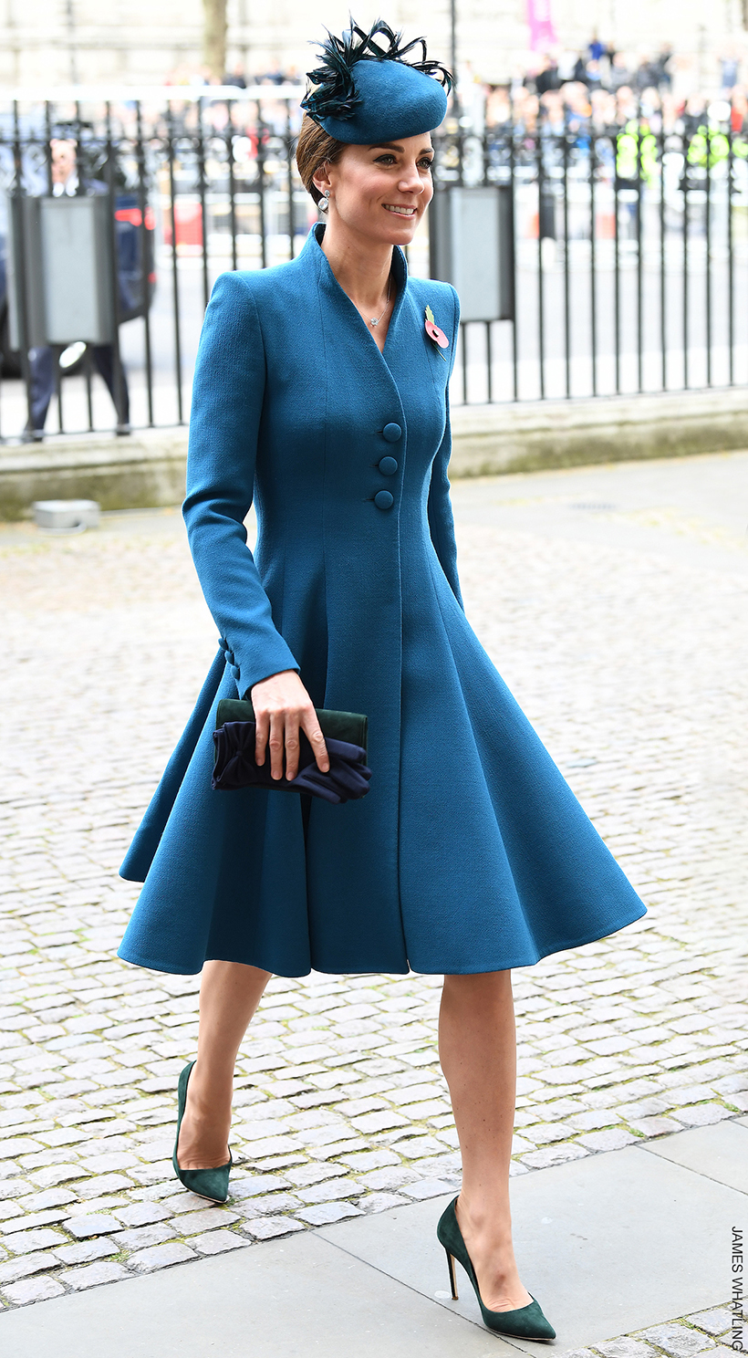
Why it works: Jewel tones can be tricky to mix, but this pairing proves that when two shades share similar depth, the result is rich, elegant and cohesive. The contrast feels confident, not clashing. The peacock feathers on her hat really tie everything together.
Try it: Mix two deep jewel tones, like teal and green or sapphire and emerald, and keep accessories minimal so the colours do the talking.